
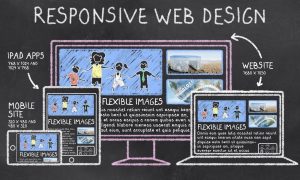
The idea of Responsive web design is to have one site, but different elements that respond differently when viewed on devices of different sizes to ensure the same contents and user experiences delivered.
Difference between Mobile Responsive and Mobile Friendly
Mobile friendly websites are basically desktop sites which are usable regardless of what device it’s viewed on. These websites doesn’t change or evolve according to the device that’s being used.
Responsive design is a method of developing websites which are completely flexible regardless of the device that’s being used. These websites ‘respond’ to the size of screen of the device. The entire site as a whole is reformatted and re-optimized to make a website responsive.
How can I tell if my website is mobile-friendly AKA Responsive Web design?
Simply click here and type in your website address. Within seconds, Google Developers will spit out a report determining whether or not your page is mobile-friendly.
If your website isn’t catering to mobile devices, or if you would like to update your website design to become mobile responsive,
Benefits of responsive web design
More Mobile traffic
It’s increasingly important for companies to have websites that render properly on smaller screens so that users don’t encounter distorted images or experience a sub-optimal site layout.
Lower Maintenance Needs
Maintaining a separate mobile site requires additional testing and support. In contrast, the process of responsive design uses standardized testing methodologies to ensure optimal layout on every screen. Having separate desktop and mobile sites also necessitates two content strategies, two administrative interfaces and potentially two design teams. Responsive design’s “one size fits all” approach means less headache for developers, business owners, and consumers. Spending less time on maintenance also frees up time to focus on more important things like marketing and content creation.
Improved User Experience
A responsive website leads to a better user experience. A major factor indicating the quality of user experience is the time they spend on your site. If they find it hard to navigate or use because they’re forced to constantly pinch and zoom, they won’t stay on your website.
But if your website scales and responds to the change in screen size, then visitors won’t have problems accessing menus, links, buttons or filling out forms. As a result, their user experience will be better and they’ll spend more time on your site.
Improved user experience and site usability can then lead to more word of mouth referrals and new customers for your business.
Improved User Experience
There are multiple wats to delivery a responsive website. in GoldIT, all our services has included responsive web design, for instance E-commerce, wordpress, Html landing page, content management system.